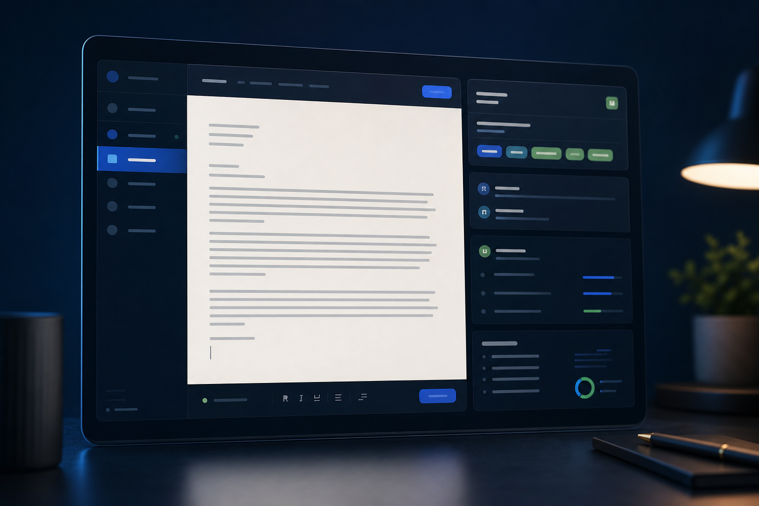
See the common layout decisions that break resume parsing and reduce your chances of making it through screening.
This resource is written for job seekers who want to make stronger, clearer decisions before they apply. The aim is not to overwhelm you with theory. It is to show the parts of the process that create the most visible improvement in screening and recruiter review.
Why formatting breaks parsing
An ATS needs to convert your resume into structured fields such as job titles, dates, employers, education, and skills. When a layout is overly decorative or inconsistent, the system has to guess where one piece of information ends and the next begins.
That guesswork is where trouble starts. A stylish visual choice can shift dates into the wrong section, merge two lines that should stay separate, or hide information inside a container the parser does not interpret cleanly.
Parsing reality
The system reads structure before it appreciates design.
If the document is hard to interpret mechanically, strong content can still lose visibility before a recruiter sees it properly.
Layouts that create the most errors
The highest-risk patterns are multi-column layouts, tables, text boxes, headers and footers with important details, graphic skill meters, and unusual section names. These elements often look clean to a person but are more likely to scramble context during parsing.
The problem is not that every ATS fails every time. The problem is inconsistency. A format that works in one workflow may break in another. If your priority is broad compatibility, the safest choice is still a straightforward one-column structure with conventional headings.
Practical checklist
- Columns can split content into the wrong reading order.
- Headers and footers may be skipped or merged unpredictably.
- Charts, icons, and visual meters rarely add screening value.
What an ATS-safe resume looks like
An ATS-safe resume is not plain because it is low quality. It is plain because it is reliable. Clear section labels, aligned dates, readable spacing, and standard bullet structures make your experience easier to extract and easier to scan.
That does not mean the page should feel dull. Good hierarchy, controlled white space, strong wording, and consistent typography still create a polished impression. Simplicity is a presentation choice, not a compromise in professionalism.
Better approach
Clarity usually looks more senior than decoration.
When recruiters can find what they need quickly, the resume feels more credible and more considered even without visual flourishes.
A fast cleanup checklist
If your current resume came from a highly visual template, simplify it in passes. First remove structural risks such as tables or split columns. Then standardize your headings, dates, bullet style, and section order. Finally, review whether the top of the page makes your target role immediately obvious.
This process is usually faster than people expect. Most conversion work is structural, not strategic. Once the layout is dependable, you can focus on stronger bullets, better targeting, and clearer keyword coverage.
Practical checklist
- Flatten multi-column content into a single reading flow.
- Move essential details out of headers, footers, and sidebars.
- Replace visual ratings with plain language descriptions.
Frequently asked questions
These are the practical questions candidates usually ask once they begin applying this guidance to a real resume.
Conclusion
Formatting mistakes are often fixable without rewriting the whole resume. The real goal is to remove anything that interrupts a clean reading order and a clean parse.
Once the structure becomes dependable, every other improvement you make, from keyword alignment to sharper bullets, has a better chance of being seen and understood.

Author bio
Owen Hart
Resume Systems Editor
Owen focuses on resume structure, parsing behavior, and the formatting decisions that shape first-pass recruiter readability.
Social links